in
1 Corinthians 16:14
"Let all that you do be done in love."
© 2024. All rights reserved to Chenice Taylor
email: chenicetaylor5@gmail.com

MARTA On The Go
Overview
CodePath x AmazonNEXT Design Challenge
Role: Lead UX/UI Designer, Lead UX Researcher
Team: 5 computer science students
Duration: 7 weeks
Tools: Figma, Google Forms for surverys
Making Metro Atlanta’s transportation application understandable to first time users.

UI Design Process
We followed MARTA’s design system for consistency:
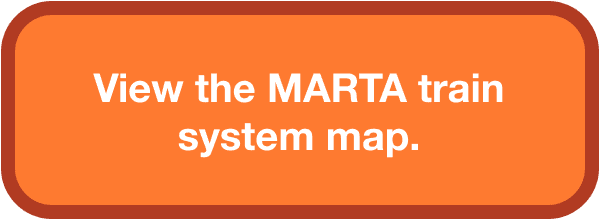
Orange accents in the tutorial to encourage user engagement
Pop-up highlights guiding users through each feature
Cleaner rider alerts to reduce clutter and improve usability
Key Design Principles
Simplicity: A streamlined interface for clarity
Visual Guidance: Highlights and step-by-step instructions
Accessibility: Large buttons, clear text, and easy navigation
Validation & Testing
Conducted usability tests and surveys on the prototype
Measured improvements in usability and clarity
Final Solution
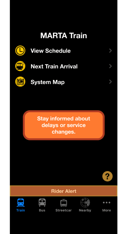
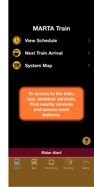
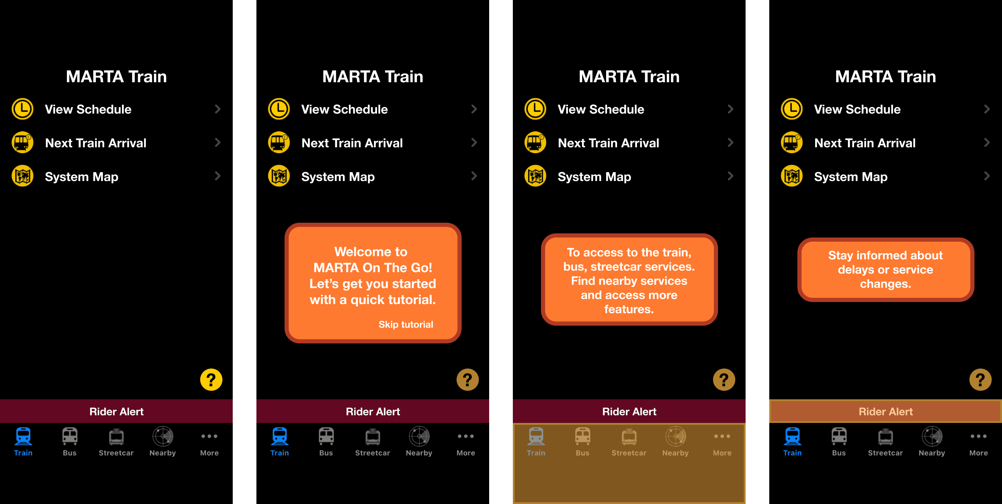
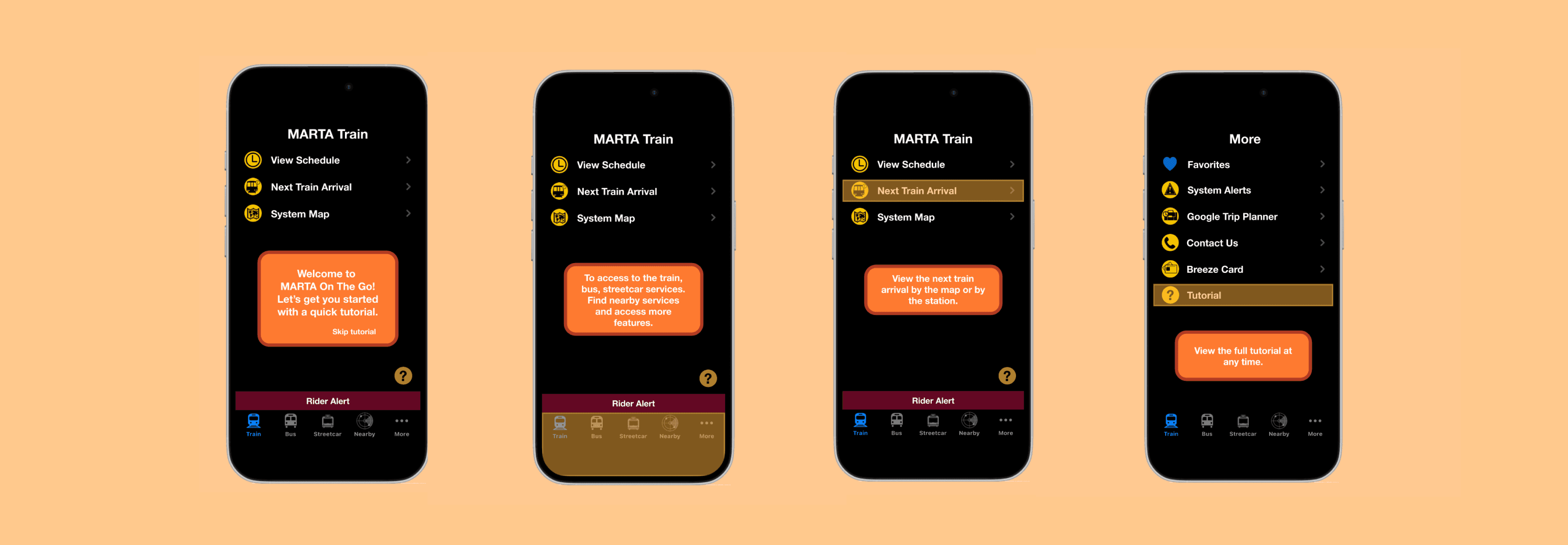
A pop-up tutorial for first-time users, with an option to skip
Step-by-step guidance on key features
Persistent access to the tutorial for reference anytime
The Problem
MARTA On The Go is an app that provides real-time transit information for Metro Atlanta citizens, but first-time users struggle with navigation and usability. According to qualitative research, pain points included:
The app isn’t user-friendly
Difficult navigation
Outdated user interface
No clear tutorial or onboarding
First-time users found it overwhelming
From our initial survey:
“Were there any points during your initial use where you felt confused or unsure about what to do next? If so, can you elaborate?”
“The app is just really poorly designed overall there are no clear instructions on what to do or how to operate the app so a lot of things are just trial and error.”
“It’s a little confusing for my first time, I think the app seems a little out dated deff can use a video or something to show how to use the app at first”
“It just seems like alot at first. For someone that has used it a few times and is still kind of new, I do not know where to start”
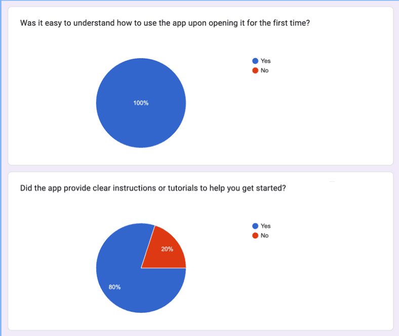
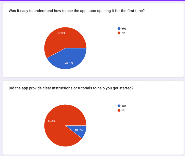
50% of first-time users said the app wasn't easy to understand
87.5% said there were no clear instructions
Average usability rating was 6.5/10


The Goal
Our goal was to improve the onboarding experience for first-time users by making the app clearer, simpler, and more accessible.
Guiding question: How might we create a welcoming, easy-to-use experience for first-time users?
Why This Problem?
After analyzing user stories and ratings, we saw that first-time users made up a large portion of our survey demographics. Improving their experience would have the greatest impact on usability.
The Solution
Research & Discovery
We explored how other apps onboard new users and found that many use tutorials to introduce features. This insight guided our approach.
Ideation & Wire framing
We brainstormed multiple solutions:
Pop-up tutorial for first-time users
UI improvements
Tooltips for guidance
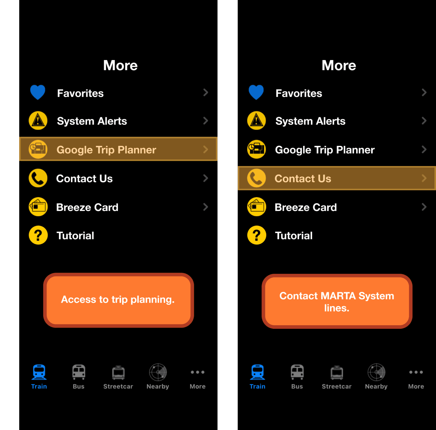
Tutorial stored in the ‘More’ page for easy access
Rider alerts redesigned for clarity
Prioritized Solutions
First-time user tutorial: A step-by-step guide introducing app features.
Persistent tutorial access: Stored in the "More" page and available on every screen.
Minor UI improvements for clarity (Rider alerts, “More page”)


→


Results and Impact
65% increase in users who said the app provided clear instructions
57.1% increase in ease of use for first-time users
Usability rating improved from 6.5 → 9.75
User feedback:
"Some MARTA riders aren’t tech-savvy—this tutorial really helps."
“I was pretty impressed and thought Marta might want to hire you guys to design this for them.”
“The orange reminds me of traffic cones”
“Were there any points during your initial use where you felt confused or unsure about what to do next? If so, can you elaborate?”
“No it was easy to understand and use.”
Reflections & Learnings
Stakeholder engagement is crucial for success. If my team and I engaged more with the mentors and stakeholders to receive valuable insights, our design process would’ve been much easier, because we would have feedback on what would and wouldn’t work from industry experts.
So what would I do anything differently? Definitely engage more with mentors! And next time, keep a hold of my sketches and low fidelity wireframes to show the depth and intention in my design process.
I enjoyed this project because I learned so many key UX design concepts and fundamentals while creating something that could potentially change people’s everyday lives. I can’t wait for the next opportunity to make an impact! Thank you so much for reading :)
Chenice
in
1 Corinthians 16:14
"Let all that you do be done in love."
© 2024. All rights reserved to Chenice Taylor
email: chenicetaylor5@gmail.com
MARTA On The Go
CodePath x AmazonNEXT Design Challenge
Making Metro Atlanta’s transportation application understandable to first time users.
The Problem
MARTA On The Go is an app that provides real-time transit information for Metro Atlanta citizens, but first-time users struggle with navigation and usability. According to qualitative research, pain points included:
The app isn’t user-friendly
Difficult navigation
Outdated user interface
No clear tutorial or onboarding
First-time users found it overwhelming


UI Design Process
We followed MARTA’s design system for consistency:
Orange accents in the tutorial to encourage user engagement
Pop-up highlights guiding users through each feature
Cleaner rider alerts to reduce clutter and improve usability
Key Design Principles
Simplicity: A streamlined interface for clarity
Visual Guidance: Highlights and step-by-step instructions
Accessibility: Large buttons, clear text, and easy navigation
Validation & Testing
Conducted usability tests and surveys on the prototype
Measured improvements in usability and clarity
Final Solution
A pop-up tutorial for first-time users, with an option to skip
Step-by-step guidance on key features
Persistent access to the tutorial for reference anytime
Results and Impact
65% increase in users who said the app provided clear instructions
57.1% increase in ease of use for first-time users
Usability rating improved from 6.5 → 9.75
User feedback:
"Some MARTA riders aren’t tech-savvy—this tutorial really helps."
“I was pretty impressed and thought Marta might want to hire you guys to design this for them.”
“The orange reminds me of traffic cones”
“Were there any points during your initial use where you felt confused or unsure about what to do next? If so, can you elaborate?”
“No it was easy to understand and use.”
Reflections & Learnings
Stakeholder engagement is crucial for success. If my team and I engaged more with the mentors and stakeholders to receive valuable insights, our design process would’ve been much easier, because we would have feedback on what would and wouldn’t work from industry experts.
So what would I do anything differently? Definitely engage more with mentors! And next time, keep a hold of my sketches and low fidelity wireframes to show the depth and intention in my design process.
I enjoyed this project because I learned so many key UX design concepts and fundamentals while creating something that could potentially change people’s everyday lives. I can’t wait for the next opportunity to make an impact! Thank you so much for reading :)
Chenice
The Solution
Research & Discovery
We explored how other apps onboard new users and found that many use tutorials to introduce features. This insight guided our approach.
Ideation & Wire framing
We brainstormed multiple solutions:
Pop-up tutorial for first-time users
UI improvements
Tooltips for guidance
Tutorial stored in the ‘More’ page for easy access
Rider alerts redesigned for clarity
Prioritized Solutions
First-time user tutorial: A step-by-step guide introducing app features.
Persistent tutorial access: Stored in the "More" page and available on every screen.
Minor UI improvements for clarity (Rider alerts, “More page”)

→


From our initial survey:
“Were there any points during your initial use where you felt confused or unsure about what to do next? If so, can you elaborate?”
“The app is just really poorly designed overall there are no clear instructions on what to do or how to operate the app so a lot of things are just trial and error.”
“It’s a little confusing for my first time, I think the app seems a little out dated deff can use a video or something to show how to use the app at first”
“It just seems like alot at first. For someone that has used it a few times and is still kind of new, I do not know where to start”
50% of first-time users said the app wasn't easy to understand
87.5% said there were no clear instructions
Average usability rating was 6.5/10
The Goal
Our goal was to improve the onboarding experience for first-time users by making the app clearer, simpler, and more accessible.
Guiding question: How might we create a welcoming, easy-to-use experience for first-time users?
Why This Problem?
After analyzing user stories and ratings, we saw that first-time users made up a large portion of our survey demographics. Improving their experience would have the greatest impact on usability.
Overview
Role: Lead UX/UI Designer, Lead UX Researcher
Team: 5 computer science students
Duration: 7 weeks
Tools: Figma, Google Forms for surverys
in
1 Corinthians 16:14
"Let all that you do be done in love."
© 2024. All rights reserved to Chenice Taylor
email: chenicetaylor5@gmail.com
MARTA On The Go
CodePath x AmazonNEXT Design Challenge
Making Metro Atlanta’s transportation application understandable to first time users.
Reflections & Learnings
Stakeholder engagement is crucial for success. If my team and I engaged more with the mentors and stakeholders to receive valuable insights, our design process would’ve been much easier, because we would have feedback on what would and wouldn’t work from industry experts.
So what would I do anything differently? Definitely engage more with mentors! And next time, keep a hold of my sketches and low fidelity wireframes to show the depth and intention in my design process.
I enjoyed this project because I learned so many key UX design concepts and fundamentals while creating something that could potentially change people’s everyday lives. I can’t wait for the next opportunity to make an impact! Thank you so much for reading :)
Chenice
Results and Impact
65% increase in users who said the app provided clear instructions
57.1% increase in ease of use for first-time users
Usability rating improved from 6.5 → 9.75
User feedback:
"Some MARTA riders aren’t tech-savvy—this tutorial really helps."
“I was pretty impressed and thought Marta might want to hire you guys to design this for them.”
“The orange reminds me of traffic cones”
“Were there any points during your initial use where you felt confused or unsure about what to do next? If so, can you elaborate?”
“No it was easy to understand and use.”
UI Design Process
We followed MARTA’s design system for consistency:
Orange accents in the tutorial to encourage user engagement
Pop-up highlights guiding users through each feature
Cleaner rider alerts to reduce clutter and improve usability
Key Design Principles
Simplicity: A streamlined interface for clarity
Visual Guidance: Highlights and step-by-step instructions
Accessibility: Large buttons, clear text, and easy navigation
Validation & Testing
Conducted usability tests and surveys on the prototype
Measured improvements in usability and clarity
Final Solution
A pop-up tutorial for first-time users, with an option to skip
Step-by-step guidance on key features
Persistent access to the tutorial for reference anytime
→


Overview
Role: Lead UX/UI Designer, Lead UX Researcher
Team: 5 computer science students
Duration: 7 weeks
Tools: Figma, Google Forms for surverys
The Problem
MARTA On The Go is an app that provides real-time transit information for Metro Atlanta citizens, but first-time users struggle with navigation and usability. According to qualitative research, pain points included:
The app isn’t user-friendly
Difficult navigation
Outdated user interface
No clear tutorial or onboarding
First-time users found it overwhelming
From our initial survey:
“Were there any points during your initial use where you felt confused or unsure about what to do next? If so, can you elaborate?”
“The app is just really poorly designed overall there are no clear instructions on what to do or how to operate the app so a lot of things are just trial and error.”
“It’s a little confusing for my first time, I think the app seems a little out dated deff can use a video or something to show how to use the app at first”
“It just seems like alot at first. For someone that has used it a few times and is still kind of new, I do not know where to start”
50% of first-time users said the app wasn't easy to understand
87.5% said there were no clear instructions
Average usability rating was 6.5/10
The Goal
Our goal was to improve the onboarding experience for first-time users by making the app clearer, simpler, and more accessible.
Guiding question: How might we create a welcoming, easy-to-use experience for first-time users?
Why This Problem?
After analyzing user stories and ratings, we saw that first-time users made up a large portion of our survey demographics. Improving their experience would have the greatest impact on usability.


The Solution
Research & Discovery
We explored how other apps onboard new users and found that many use tutorials to introduce features. This insight guided our approach.
Ideation & Wire framing
We brainstormed multiple solutions:
Pop-up tutorial for first-time users
UI improvements
Tooltips for guidance
Tutorial stored in the ‘More’ page for easy access
Rider alerts redesigned for clarity
Prioritized Solutions
First-time user tutorial: A step-by-step guide introducing app features.
Persistent tutorial access: Stored in the "More" page and available on every screen.
Minor UI improvements for clarity (Rider alerts, “More page”)